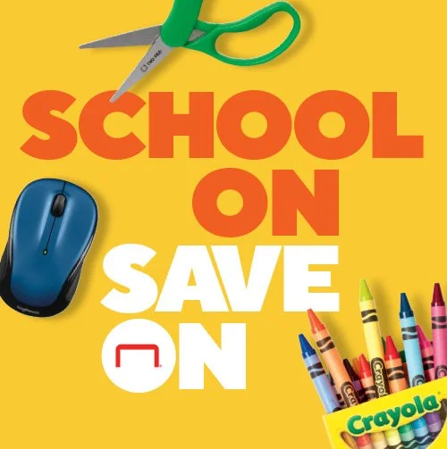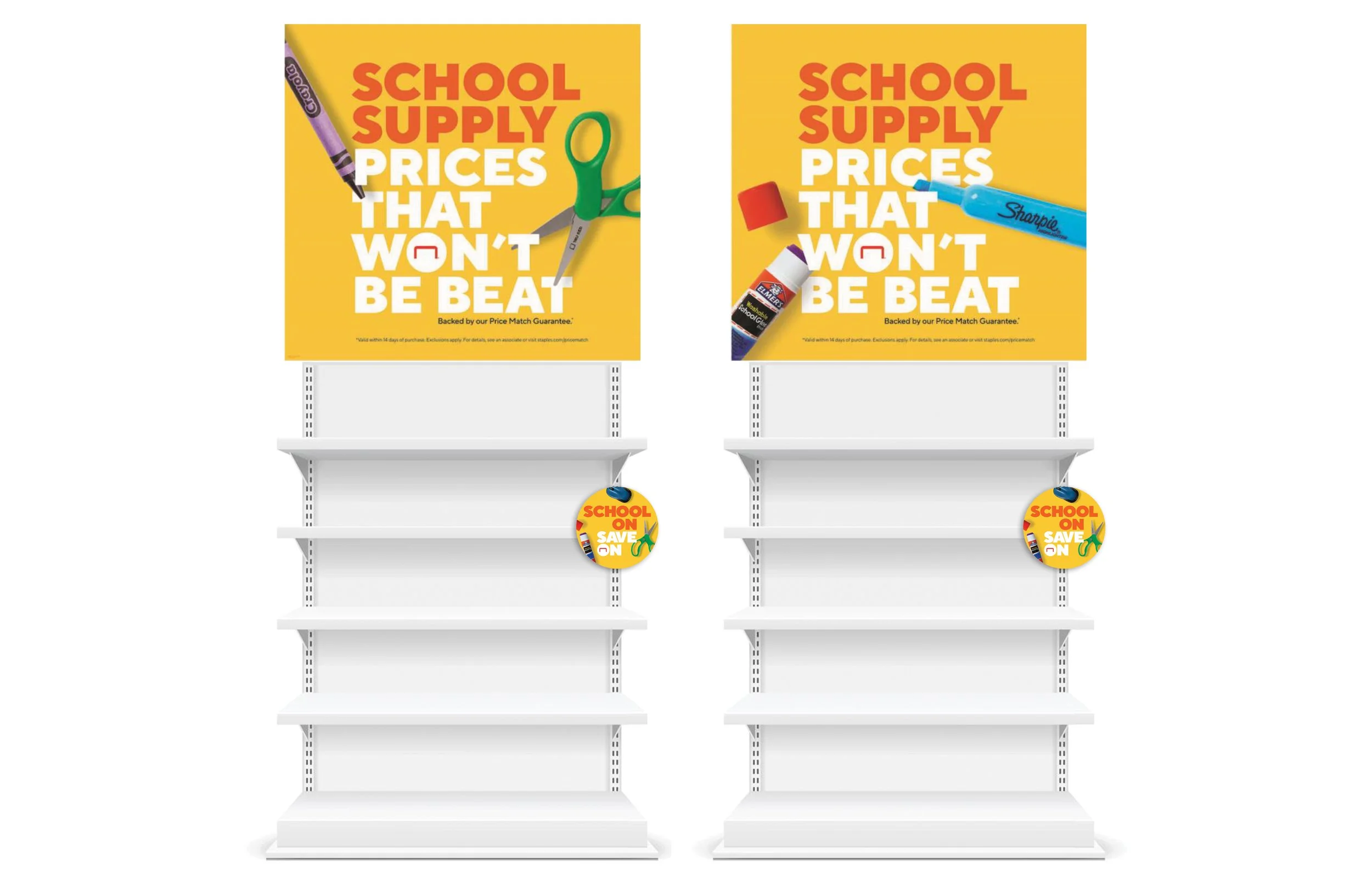


Back to School was an omni-channel seasonal campaign focused on creating an impactful and cohesive customer experience across Staples. The challenge was to bring together iconic school supplies, tech products and featured promo offers while keeping the season playful, relevant and easy to shop. The campaign kicked off with promotional in-store signage built around the “school on, save on” idea, followed by a broader marketing strategy centered on the value statement “school supply prices that won’t be beat,” backed by the Staples Price Match Guarantee. Consistent colors, products, typography and visual elements carried the campaign across retail, digital, email, social, app and print, creating a connected experience throughout the season. The campaign ultimately came to life across 100+ assets, including cohesive in-store experiences developed from initial brief through installation.
Role: Lead Designer
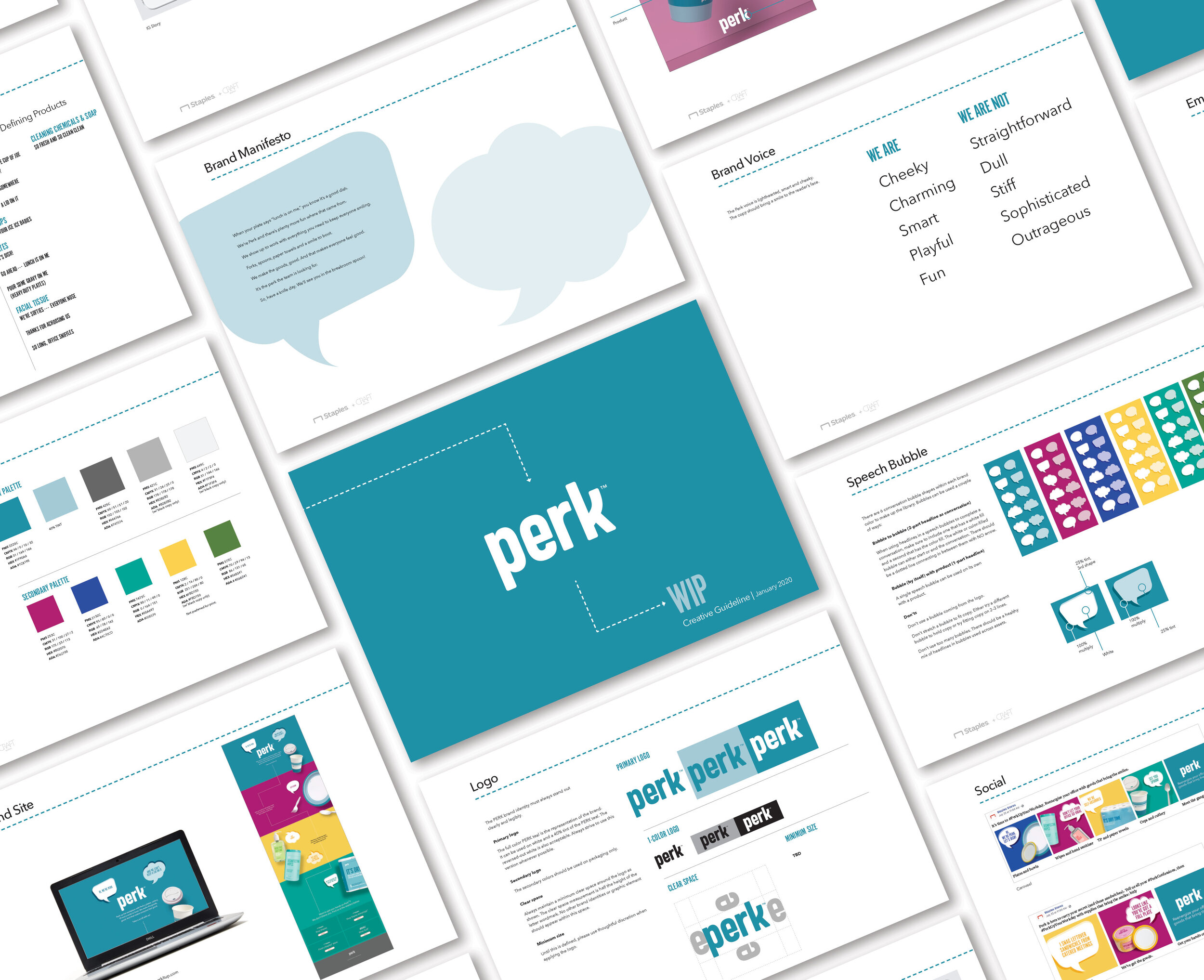
As part of the Staples private brands group, Perk was created to introduce a new personality to the breakroom supplies category. The opportunity was to make Perk feel different from a typical breakroom supplies brand and establish a visual identity that could carry across the brand as it launched. Through charm, wit and personality, the identity uses bright colors, engaging speech bubbles and a playful visual language to let the world know that Perk is no ordinary breakroom supplies brand. The work established the visual identity, brand guidelines and foundational design system needed to bring Perk to life consistently from concept through rollout.
Role: Designer
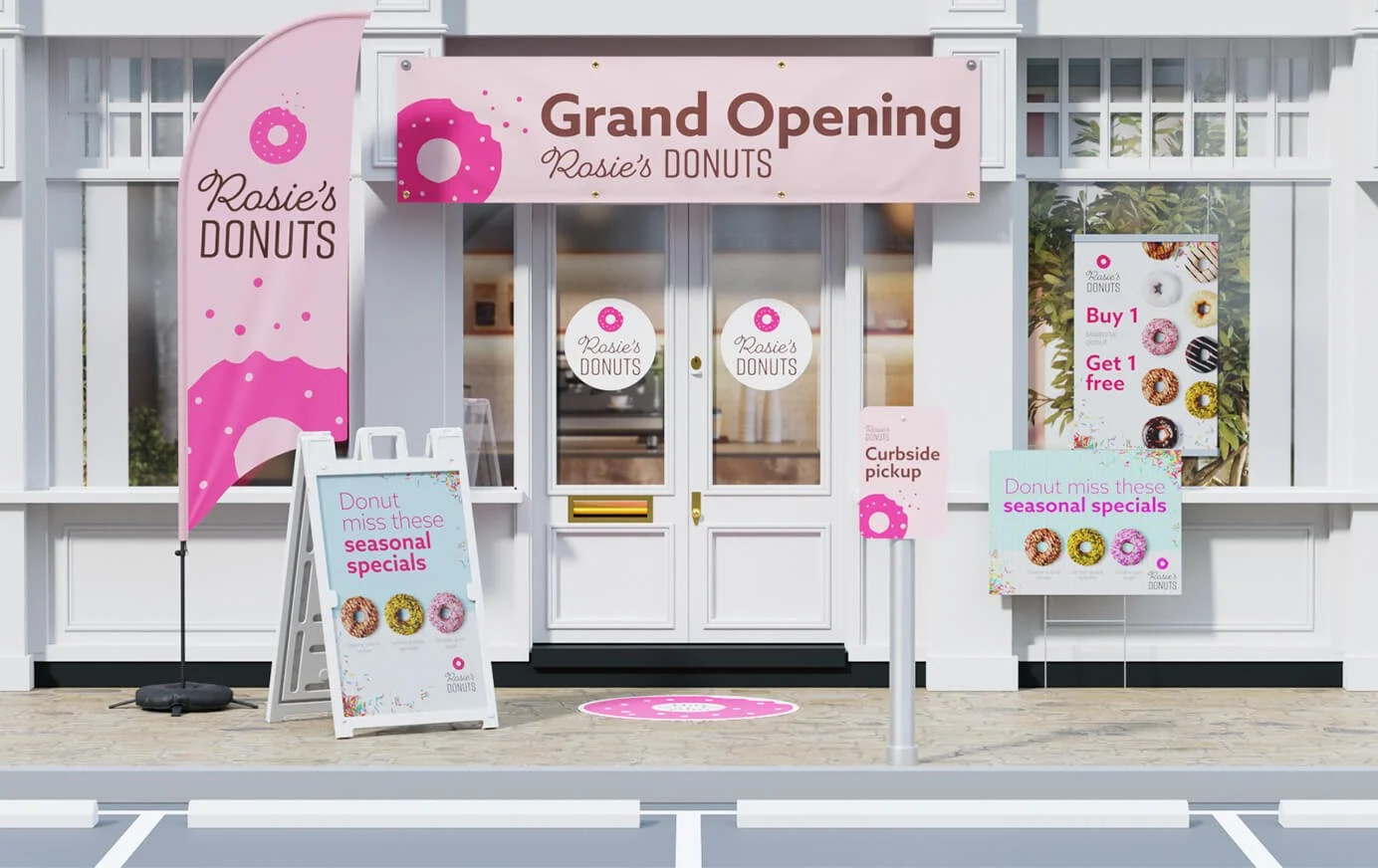
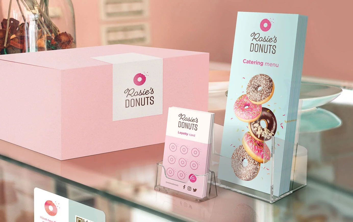
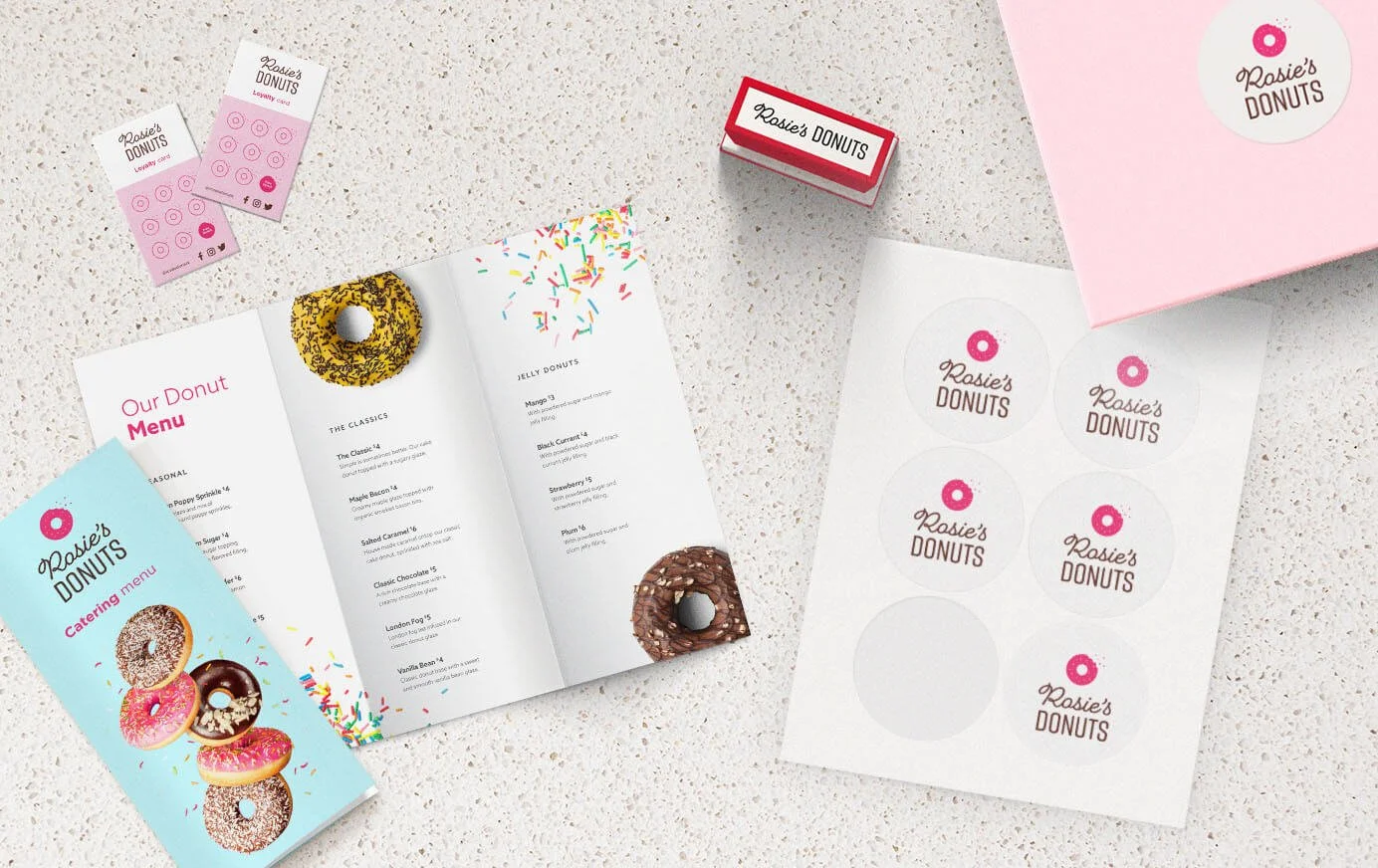
Rosie’s Donuts was created as a small business print and marketing solution that could show the range of what Staples Print Services can offer. Rather than showcasing individual print products on their own, the project brought them together as a cohesive branded experience for a fictional small business. The solution included everything from parking signs, feather flags, custom decals and A-Frames to stickers, brochures and loyalty cards, demonstrating how print can work together across the customer experience. The result was a tangible example of how Staples can help a small business build a recognizable brand through a variety of printed marketing materials.
Role: Lead Designer
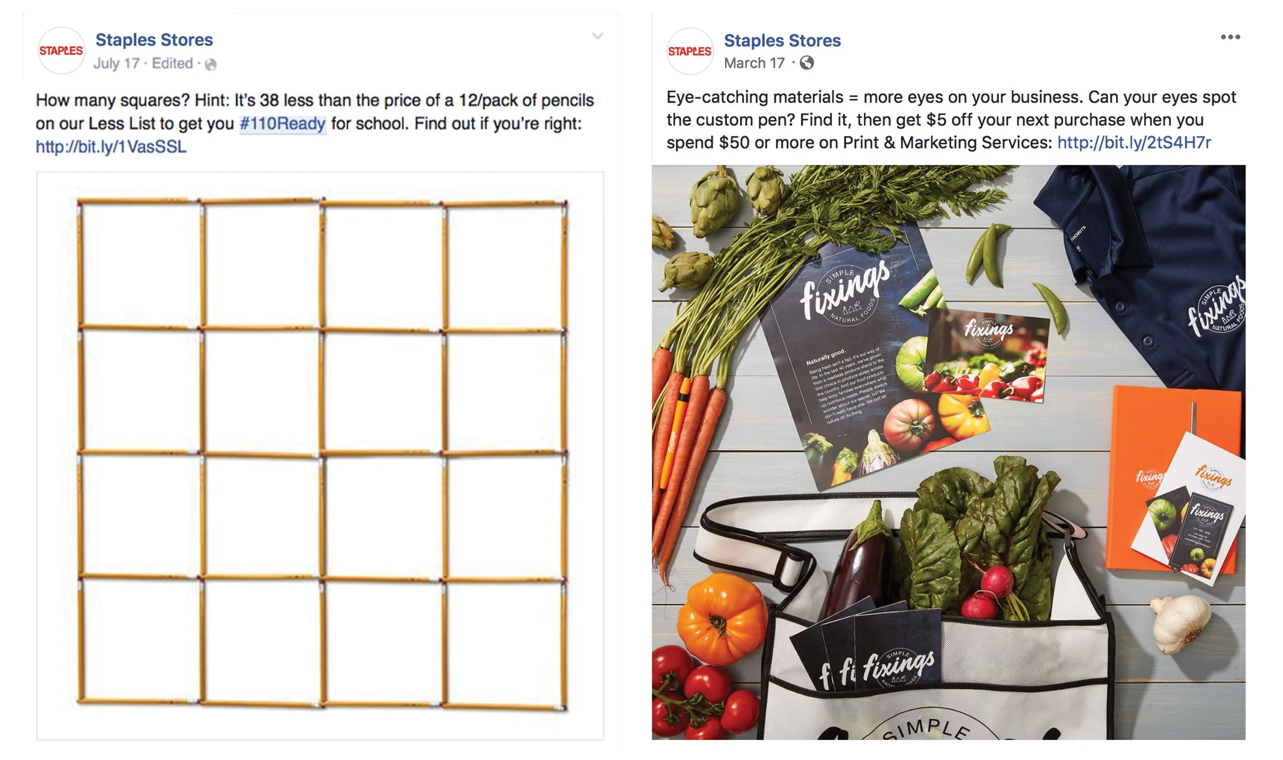
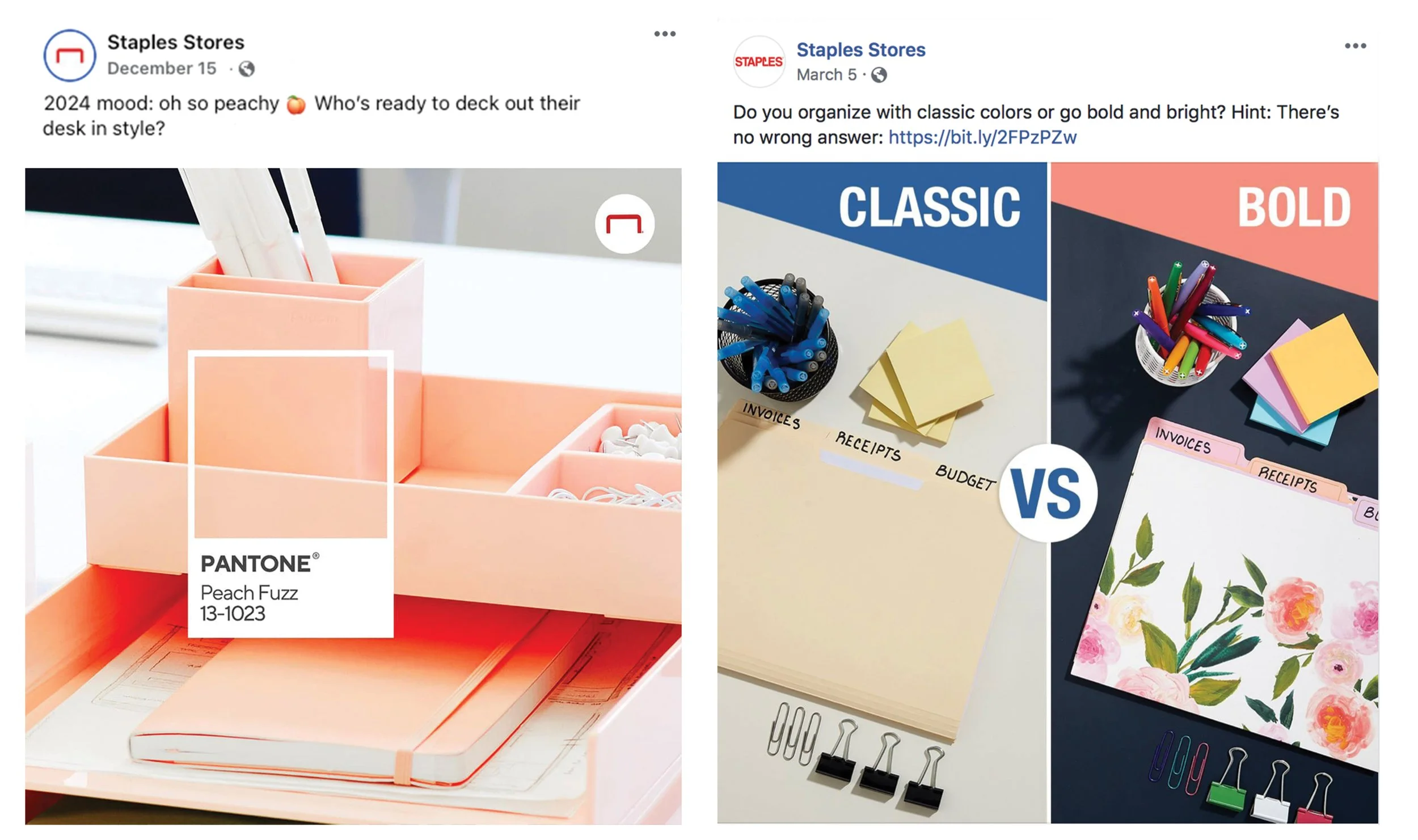
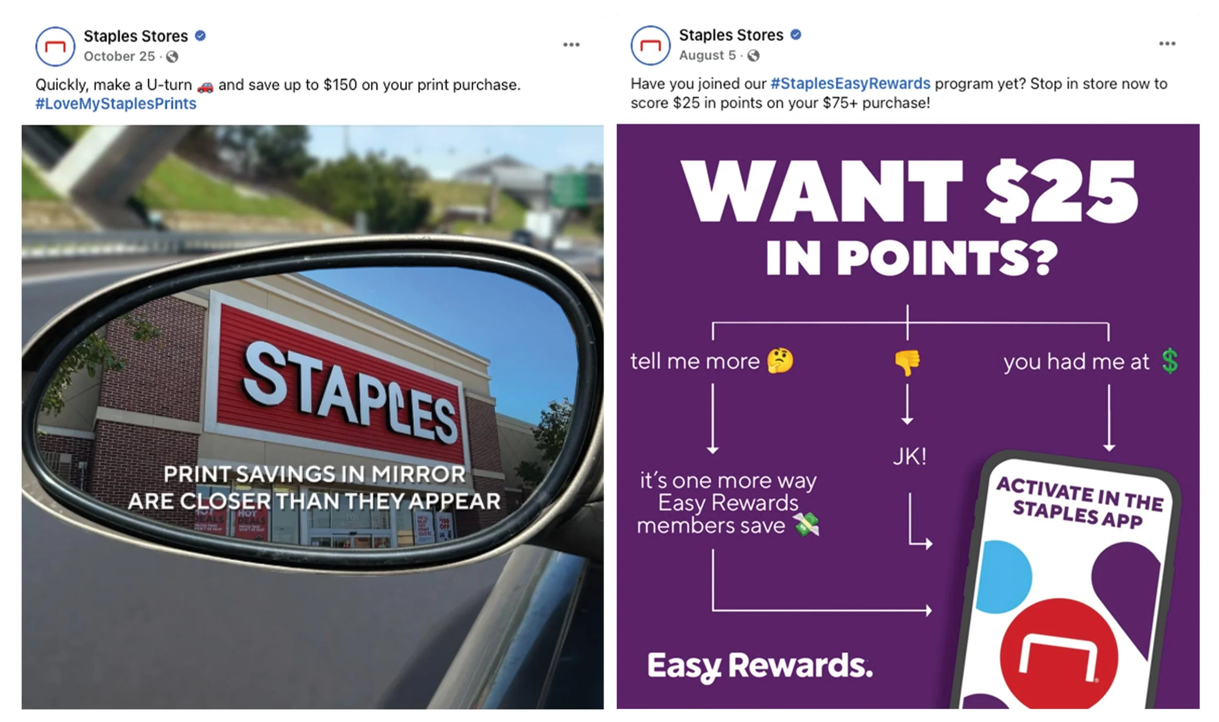
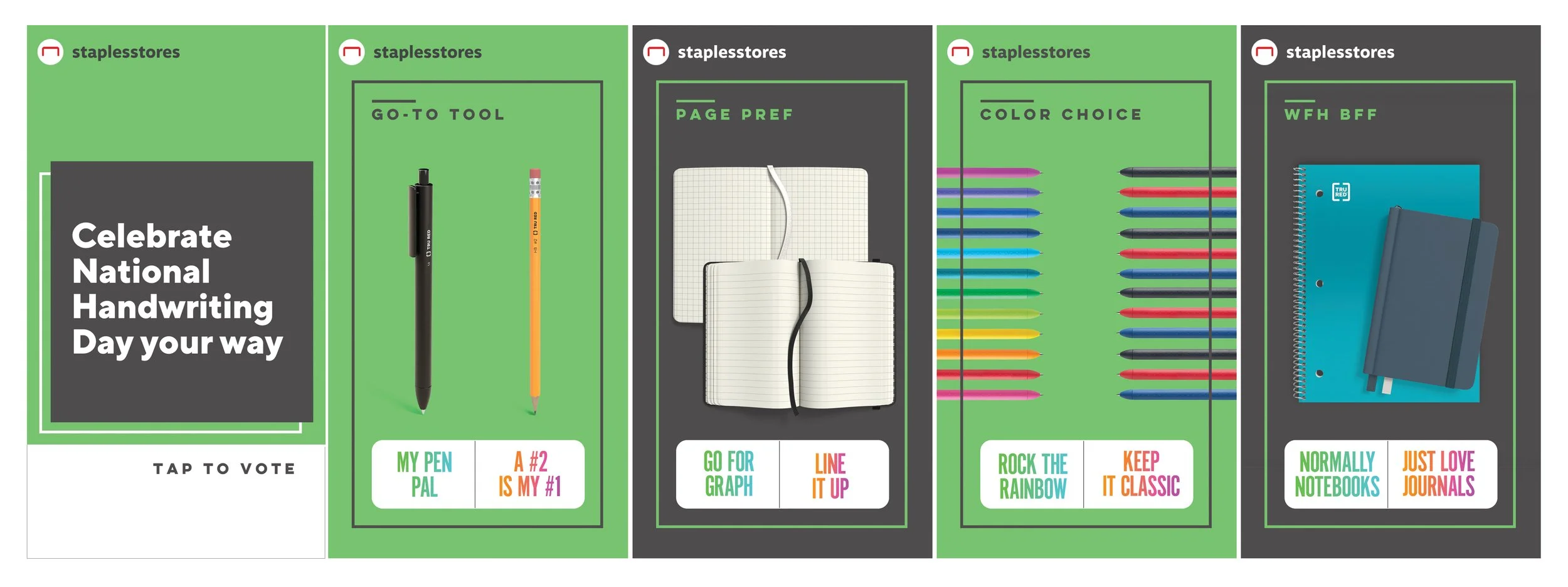
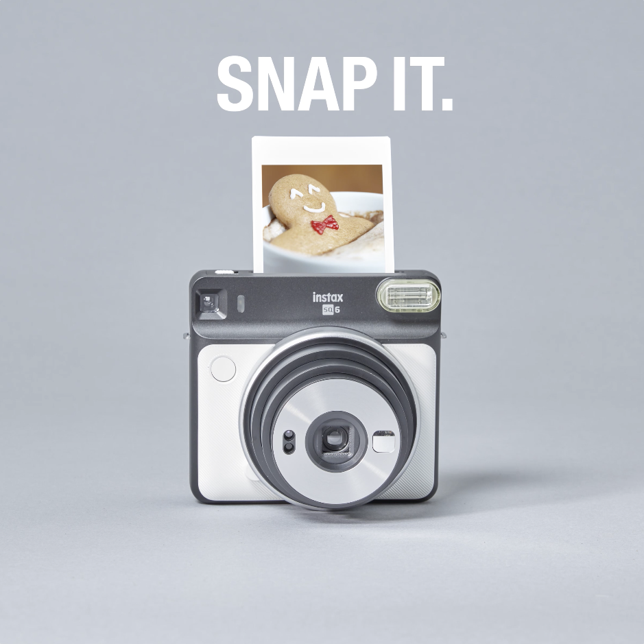
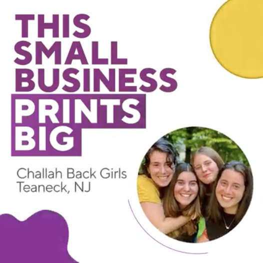
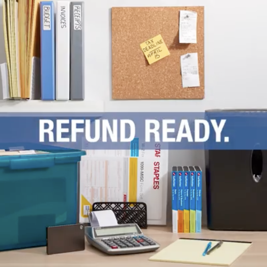
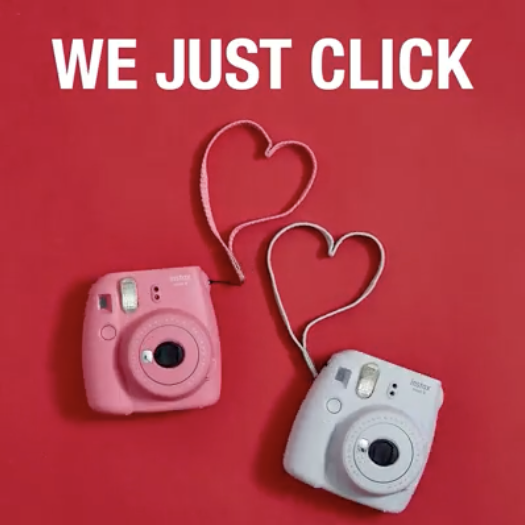
These social posts are a collection of high-performing concepts that use games, trends, cultural moments and unexpected ideas to encourage engagement and impressions while supporting brand awareness and growth. The challenge was to find ways to make company-wide initiatives feel relevant and ownable rather than simply translating traditional campaign creative into a social format. Where photography could strengthen the idea, I also concepted and art directed photoshoots. The result was social-first creative that balanced polished brand storytelling with trend-driven content, motion and ideas designed specifically for the platform.
Role: Lead Designer, Content Creation, Photo Art Direction
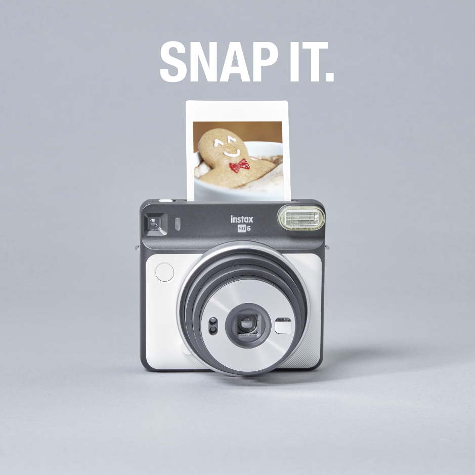
These stop-motion videos were created to bring seasonal products to life on Facebook and Instagram while building brand awareness and supporting conversion. The challenge was to make product-focused content feel more dynamic and engaging than a traditional product post. I concepted the ideas, styled the products and art directed the photoshoots to create playful stop-motion animations that gave the seasonal products movement and personality. The final pieces became social-first content that combined product storytelling with a more unexpected and engaging visual approach.
Role: Designer, Content Creation, Photo Art Direction, Video Animation
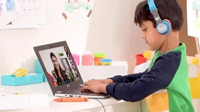
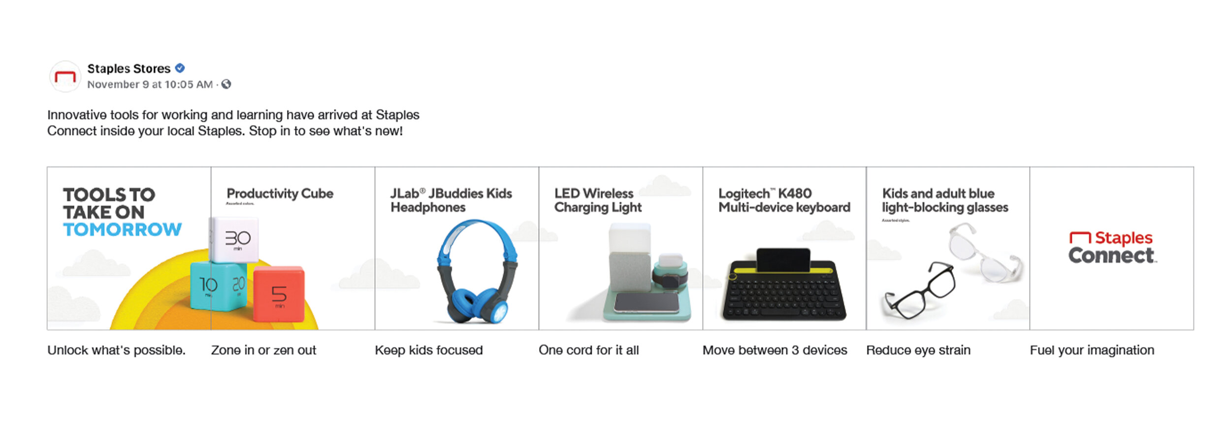
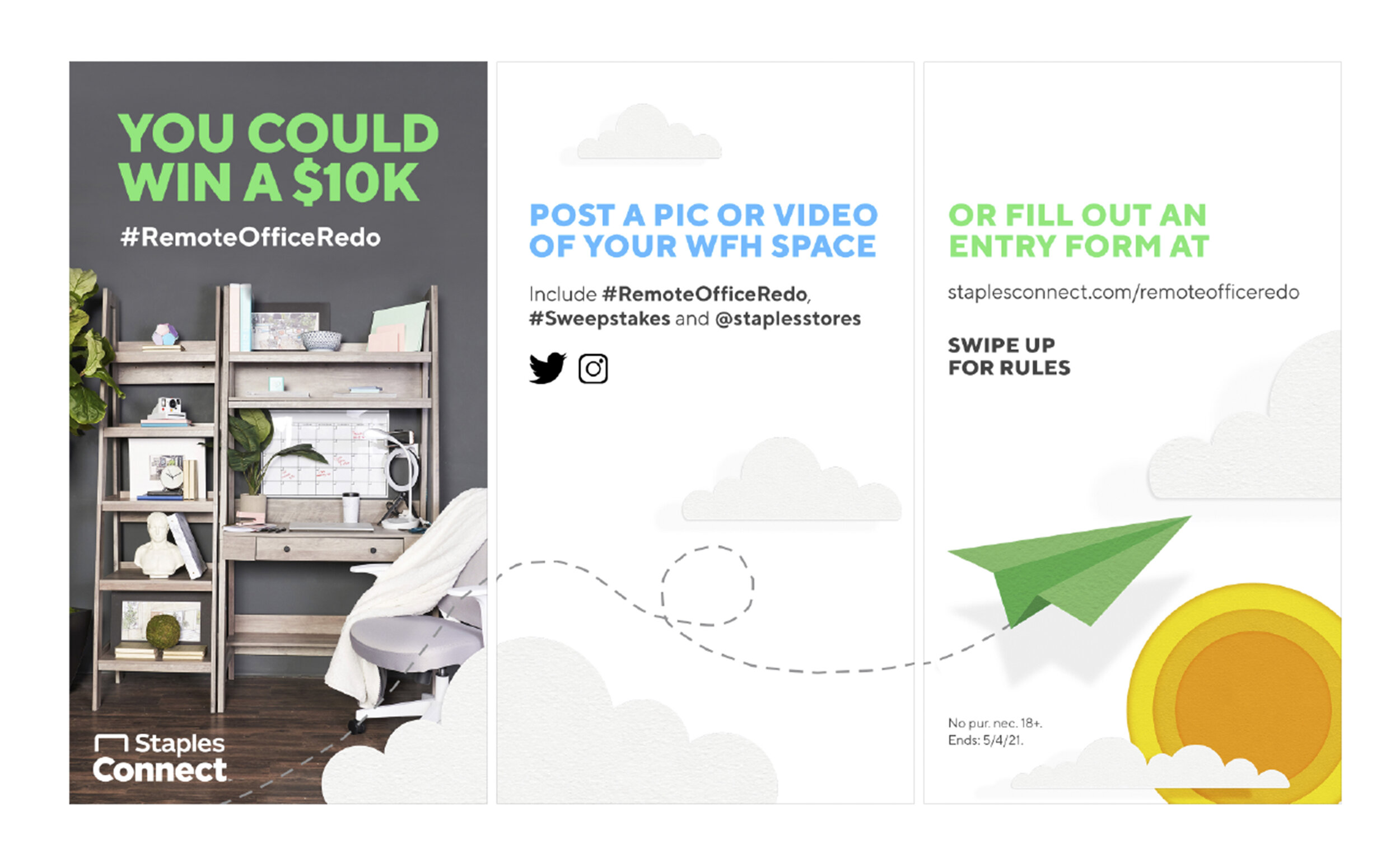
The World of Possible campaign was created to establish Staples Connect as a leader in working and learning while differentiating the brand and changing how customers perceived its authority and expertise. The challenge was to move beyond simply showcasing products and instead communicate the possibilities that products and services could create for people at work, at home and while learning. The campaign brought that idea to life by celebrating working and learning and focusing on innovative products and services that provide solutions. Across a range of print and digital deliverables, the creative helped establish a more differentiated and credible expression of the Staples Connect brand.
Role: Designer, Video Animation
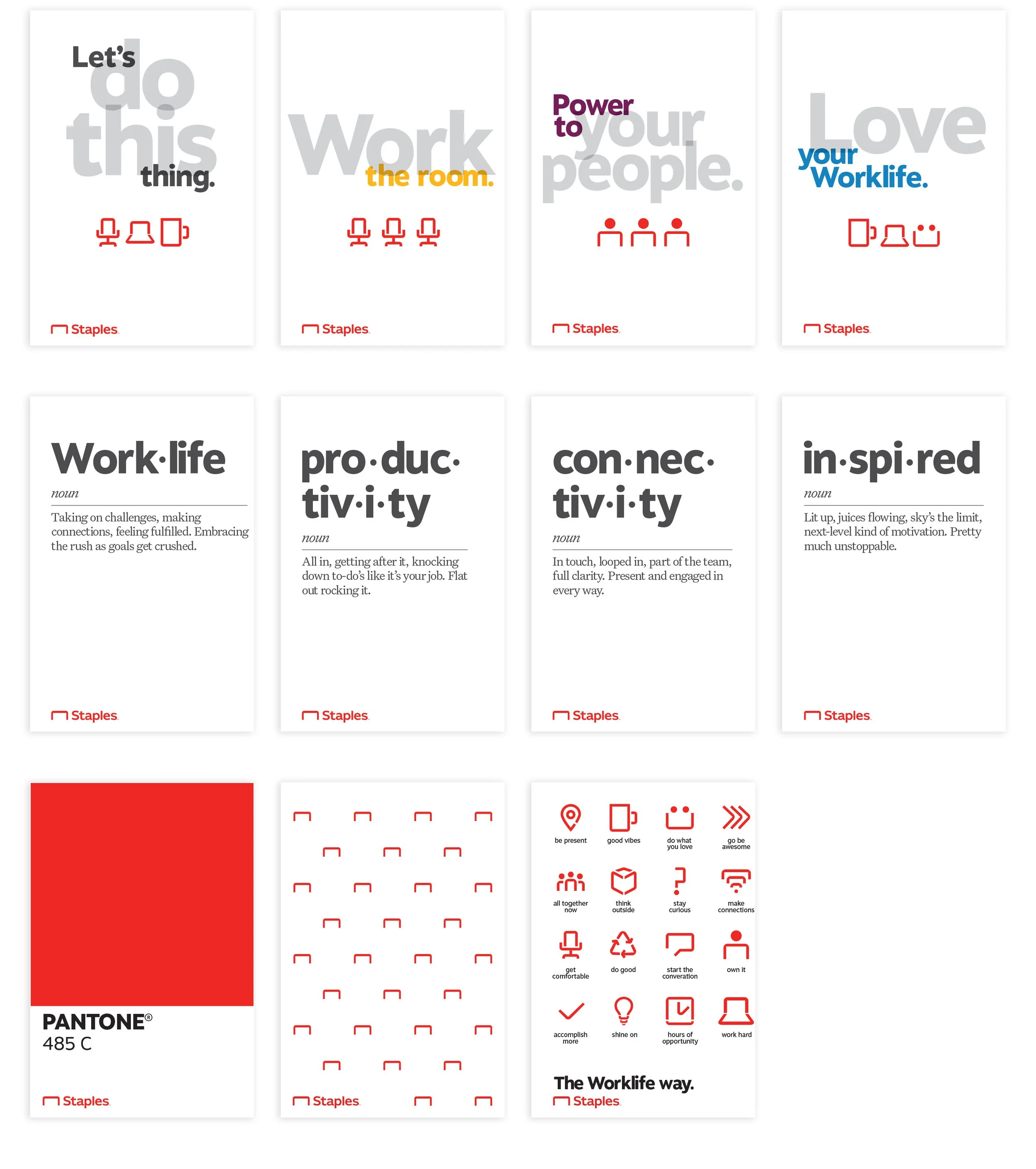
The Staples Home Office project was an internal brand launch designed to transform high-traffic areas of the Staples home office that had become old and outdated. The goal was to create a stronger, more engaging brand experience for associates while introducing a new B2B brand internally. I developed a series of environmental graphics that brought the brand into executive meeting rooms, conference rooms, the cafeteria, auditorium and lobby entrance. By extending the brand beyond traditional marketing materials and into the physical workplace, the project gave the new identity a consistent presence throughout the building and created a more cohesive internal experience.
Role: Designer
The Staples Connect service brochures were created to showcase the range of offerings and services available within retail stores while making sure the materials felt like part of the same family. I developed a shared template and visual system that could be applied across all five brochures, creating consistency in typography, layout and overall brand expression while allowing each brochure to communicate its own service offering. The result was a connected print system that made the individual brochures feel cohesive when presented together.
Role: Designer